Most paint companies announce one Colour of the Year and leave it at that. Sherwin-Williams does something bigger: every year its Trendsight Team publishes Colormix, a full forecast of the colours it expects to shape design. For 2026 the forecast is called Anthology Volume Two. “Now, for 2026 Colormix Trend Forecast Anthology Volume Two, Sherwin-Williams’ Trendsight Team of expert forecasters has refined its initial selections, creating a collection of 48 hand-selected colors, including neutrals, pastels, dark colors and reds and golds.” Forty-eight colours, organised into four palettes of twelve, each one an evolution of a colour family the brand has been tracking for years.

A Forecast That Comes Every Two Years
Colormix used to arrive every year. “For more than two decades, Sherwin-Williams had been releasing its annual Colormix forecasts. In 2024, the company changed its approach, opting for a biennial approach to the annual color trend report with Anthology: One in 2024.” Colour families move slowly, and a two-year cycle follows that movement instead of inventing a new story every autumn.
“This recurring color reference alternates each year with the usual style and trend storytelling that the brand is known for,” says Emily Kantz, color marketing manager at Sherwin-Williams. “In 2024, we examined the emerging hues of the moment, organized into four distinct palettes: blues and greens, reds and purples, deeps and darks, and delicate tints. With Anthology Volume Two, we’re continuing to evolve how we tell the story of color.” The 2026 edition keeps the four-palette structure but reframes every family: blues and greens become Frosted Tints, reds and purples become Sunbaked Hues, deeps and darks become Restorative Darks, and delicate tints become Foundational Neutrals. The forecast is also the document the Colour of the Year comes from: “From the Colormix Trend Forecast, Sherwin-Williams’ Color of the Year is drawn, as well as its featured Colors of the Month for the upcoming year.” Universal Khaki SW 6150, the 2026 Colour of the Year, sits inside the Foundational Neutrals palette below.
Palette One: Frosted Tints
The lightest palette is also the coolest. “This palette features a series of blues and greens, including Modern Lavender SW 9688; Grape Mist SW 6548; Lite Lavender SW 6554; Solitude SW 6535; Upward SW 6239; Breathtaking SW 6814; Samovar Silver SW 6233; Tradewind SW 6218; Liveable Green SW 6176; Halcyon Green SW 6213; Watery SW 6478; and Celery SW 6421.” Twelve colours, all pale, hazy, or washed — lavender, mist, and aqua tints that read as colour without shouting.
“Frosted Tints brings a modern coastal charm, blending softness with a fresh interpretation of industrial design,” says Kantz. “It’s light, airy and subtly sophisticated.” The palette is the clearest sign that pastels are back, but not the candy pastels of a decade ago: these are milky, greyed pastels, the kind that work on a whole wall rather than an accent. “An evolution of the delicate tints from previous forecasts, milky pastels are making their magnificent return, unfolding in spaces defined by effortlessly clean lines, artful accents, and elevated styling.” A bedroom in Upward or Solitude is the obvious use; a bathroom in Watery is the braver one.
Palette Two: Sunbaked Hues
If Frosted Tints is the cool breath, Sunbaked Hues is the warm exhale. “This palette has a wide range of reds, yellows, golds, pinks, oranges and purples, such as Lemon Chiffon SW 6686; Sundew SW 7688; Coral Island SW 6332; Straw Harvest SW 7698; Sociable SW 6359; Henna Shade SW 6326; Classical Yellow SW 2865; Armagnac SW 6354; Peppery SW 6615; Pennywise SW 6349; Cajun Red SW 0008; and Heartthrob SW 6866.” The names tell the story: lemon, sundew, straw, henna, armagnac — colours named after things warmed by the sun.
“Sunbaked Hues span a broad stylistic spectrum, from Mid-Century Modern and desert organic to retro-inspired aesthetics,” Kantz notes. “These colors feel warm, grounded, and nostalgic.” This is where the forecast’s big claim lives: “For 2026, we cover yellow and oranges in a more robust way that shows the importance of these hues have moving into 2026, a powerful emergence in warmer colors that evoke a sense of grounding and nostalgia.” Yellow has been the hardest colour to sell in interiors for years, and the forecast answers by showing it muted and earthy: Straw Harvest and Classical Yellow are yellows with brown in them, Henna Shade and Armagnac are reds with earth in them. A kitchen in Sundew with cream cabinets, or a dining room in Coral Island with dark wood, uses the warmth without letting it take over.

Palette Three: Restorative Darks
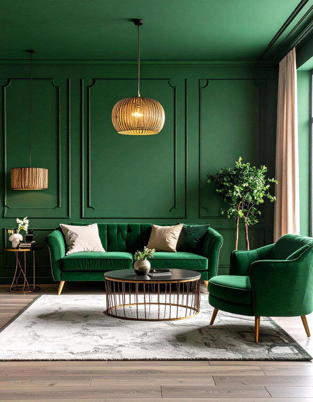
The third palette is for rooms you retreat into. “This palette features deep colors including Sable SW 6083; Rojo Marrón SW 9182; Roycroft Copper Red SW 2839; Limestone SW 9599; Relic Bronze SW 6132; Dark Auburn SW 6034; Garden Gate SW 6167; Rock Bottom SW 7062; Black Bean SW 6006; Tarragon SW 9660; Sea Mariner SW 9640; and Plum Brown SW 6272.” Sable, Black Bean, Rock Bottom: the names are heavy, and the colours are too — deep browns, blacks, plums, and nocturnal blues and greens.
“Restorative Darks offer high-impact, working beautifully in both contemporary and traditional art-deco inspired spaces,” Kantz adds. “Restorative Darks evokes the continued need for escapism and comfort found in cocooning darks. They’re bold, moody, and deeply expressive.” Cocooning is the key word: a study, a media room, a bedroom, a dining room used at night. The palette rewards commitment — a single dark accent wall can look unfinished, but a whole room in Garden Gate or Sable, with warm lamplight and pale wood, feels deliberate. Test a large swatch under the room’s actual evening lighting first: a dark room with poor light feels small, and these colours are at their most honest at night.
Palette Four: Foundational Neutrals
The last palette is the quiet one, and the most useful. “This palette includes White Snow SW 9541; Sanctuary SW 9583; Passive SW 7064; Cream and Sugar SW 9507; Mushroom SW 9587; Rare Gray SW 6199; Universal Khaki SW 6150; Sanderling SW 7513; Pavestone SW 7642; Clove SW 9605; Armory SW 9600; and Inkwell SW 6992.” White, taupe, mushroom, khaki, and a near-black in Inkwell: twelve neutrals from crisp white to inky blue-black, designed to sit underneath the other three palettes.
“Foundational Neutrals serve as a flexible base, easily adapting to layered maximalist palettes or clean Scandinavian minimalism,” Kantz says. “Foundational Neutrals is part of a need for timeless shades that fit within any design style, mixed and matched with other neutrals, wood tones or metal finishes found in home accessories. They’re timeless and grounding.” The palette’s most famous member is Universal Khaki, the 2026 Colour of the Year, and its presence here is the point: the year’s headline colour is not a wild choice but a neutral drawn from a family of neutrals. Paint the shell from this palette — White Snow on ceilings, Sanctuary on walls, Inkwell on doors — and any colour from the other three palettes can be added as furniture, art, or textiles without repainting.
“What ties them together is their adaptability across design styles and their ability to evoke emotion – whether it’s calm, warmth, drama, or simplicity,” Kantz concludes. “Each palette stands on its own, but together they reflect a broader movement toward thoughtful, expressive design.” Pick one palette as your base, borrow one colour from another as an accent, and start with a sample pot.
Putting It Together: A Fictional Example
Fictional example: imagine Priya, a fictional homeowner in Austin, repainting a 1990s house she bought last year. She starts with the forecast’s own logic: Foundational Neutrals for the shell — Sanctuary on the living room walls, White Snow on the ceilings, Inkwell on the front door. Then one colour from another palette per room: Upward from Frosted Tints in the bedroom, Sundew from Sunbaked Hues in the kitchen, Garden Gate from Restorative Darks in the study. She paints a square metre of each first. One forecast, four palettes, and a house that feels planned rather than painted.
Frequently Asked Questions
What is the Sherwin-Williams Colormix Forecast 2026?
Anthology Volume Two: 48 colours in four palettes of twelve — Frosted Tints, Sunbaked Hues, Restorative Darks, and Foundational Neutrals — from Sherwin-Williams’ Trendsight Team.
How is it different from earlier Colormix reports?
It is the second edition of the biennial Anthology format, started in 2024, which organises colours by evolving colour families.
Where does the 2026 Colour of the Year fit in?
Universal Khaki SW 6150 sits inside the Foundational Neutrals palette. The Colour of the Year is drawn from the Colormix forecast, along with the featured Colours of the Month.
Which palette should I start with?
Foundational Neutrals for walls, ceilings, and trim, then one colour from another palette per room — a Frosted Tint for calm, a Sunbaked Hue for warmth, a Restorative Dark for drama.
Can I buy all 48 colours?
Yes, at Sherwin-Williams stores nationwide and online — start with sample pots.