Every year the big American paint brands pick their Colour of the Year and the headlines write themselves. Little Greene, a 300-year-old family-run business based in North Wales, does things more quietly — but for 2026 it made its choice just as clearly. “Little Greene, a 300-year-old family-run business based in North Wales, recently announced its 2026 Color of the Year as ‘Adventurer,’ which is fitting for any beige-weary design enthusiast this side of the Atlantic. It’s a regal plum shade that seems pulled from a study, ready to envelope you in deep chats and imaginative stories.” A plum, not a brown, not a green: the boldest pick of a year when almost every brand chose a warm neutral.
What Adventurer Actually Is
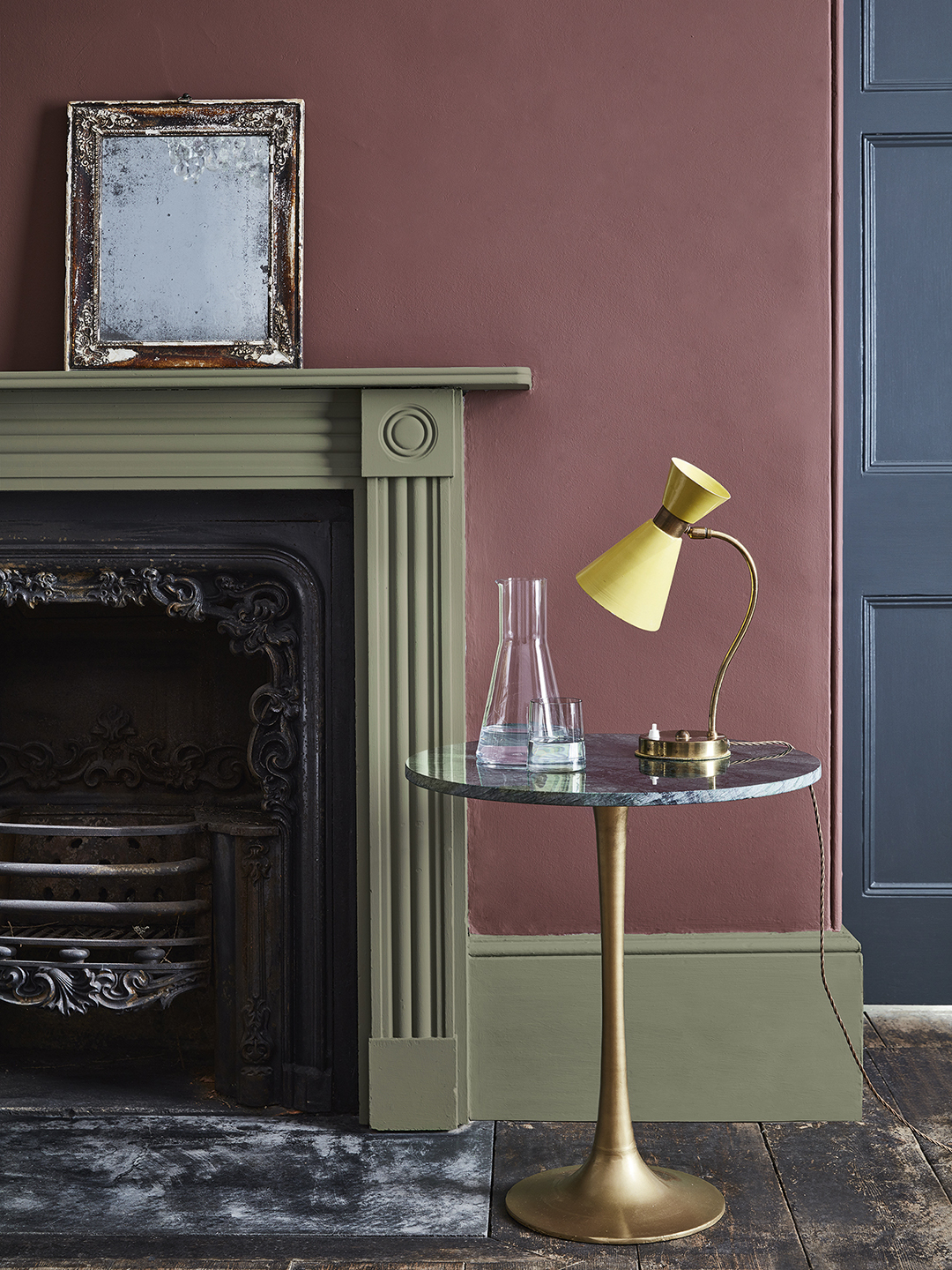
Adventurer is Little Greene colour No. 7 on the brand’s colour card — a deep plummy brown shade, in the brand’s own words, and a rich plum aubergine in the words of its creative director. “Little Greene named Adventurer, a deep plummy brown shade, as their Color of the Year.” The two descriptions disagree slightly, and both are right: the colour sits exactly where plum, burgundy, and brown meet, so it reads as a different one of the three depending on the light. In daylight it shows its purple-red side; under warm lamplight it shows its brown side; against white trim it looks plum; against dark wood it looks burgundy.
That ambiguity is the colour’s strength. A pure purple can feel cold and theatrical; a pure brown can feel safe and dull. Adventurer is neither, and that is why Ruth Mottershead, creative director at Little Greene, describes it the way she does: “Regal, reassuring plum aubergine hues like Adventurer are historically associated with opulence, providing the perfect shades to combine luxury with tranquillity, intimacy, and restfulness in bedrooms, dining rooms, and baths.” Opulence and restfulness in the same sentence — luxurious without feeling formal, calm without feeling boring. “This sumptuous hue provides a sophisticated alternative to brown for an elevated scheme with a beautiful, charismatic depth of color.”
The name is part of the pitch. “The name itself reflects what a bold and adventurous choice this color represents—it’s that striking purple-red that’s both trendy and unique at the same time,” says Mottershead. “While purple tones are having their moment right now, this particular shade is such a distinctive choice that most people wouldn’t dare to pick it, making it perfect for someone looking to create a truly one-of-a-kind color scheme.” The colour is for the homeowner who has already tried beige and sage and wants a real decision next.
The Burgundy Moment
Adventurer arrives at the head of a movement. “For 2026, we will see a natural progression in the use of burgundy in interior design, with shades of red, pink, and purple all becoming more popular as customers continue to demonstrate more color confidence in their homes,” predicts Mottershead. The progression has three steps: “In recent years, we’ve seen a clear movement towards warm, earthy colors that provide soothing, comforting interiors, helping customers connect more with the natural environment. We first saw this in the use of calm, earthy neutrals that have an inherent warmth to them, and more recently in the return of brown, with deep, sumptuous chocolate hues being embraced alongside rich caramels and honey tones to create elegant and indulgent spaces that offer real comfort.”
Warm neutrals, then chocolate browns and caramels, then burgundy and plum: each step bolder than the last. “Clients have been opting for earthier shades with warmer undertones that are being pulled through to richer colors—deep caramel, honey, and chocolate hues that have a real sumptuous feel to them.” Adventurer is what happens when that pull-through reaches purple.
Adventurer also sits at the centre of a wider Little Greene grouping for 2026: the brand’s “sunset tones”, with Adventurer as the central hue, alongside Ashes of Roses, Nether Red, Roman Plaster, and Beauvais Lilac. The grouping answers the first question about a bold colour — what goes with it? Its own family: a dusty rose, a deep red, a warm plaster, a soft lilac. For anyone who loves the idea but fears the depth, the brand’s own blog offers a gentler cousin: “Darker aubergine shades like Córdoba provide a good alternative to navy, charcoal or brown if you’re seeking an elevated look.”

Matte or Gloss: Two Different Colours
One of the most useful things Mottershead says about Adventurer is that the finish changes the colour. “The chameleon-like formula of Adventurer gives it flexibility to pair with myriad tones, while implementing the shade in matte or high-gloss finishes offer distinct options for its implementation. ‘In a matte finish, Adventurer emphasizes the color’s sumptuous depth, perfect for creating sophisticated spaces that combine luxury with tranquillity and restfulness,’ suggests Mottershead. ‘Switch to a high-gloss finish, and the reflective surface amplifies Adventurer’s rich red undertones, creating that opulent presence historically associated with wealth and luxury. The way light interacts with different finishes adds beautiful depth—designers can use varying sheen levels with Adventurer to create visual intrigue and dynamic schemes. This charismatic depth of color makes Adventurer perfect for both intimate sanctuaries and bold statement elements.'”
In practice: matte on bedroom walls for quiet depth; gloss on a front door, island, or joinery to bring out the red. Use both in one room — matte walls, gloss door — and test both finishes on one swatch card first.
We have also covered Farrow & Ball Naperon: The Peachy Terracotta Picked as Its 2026 Colour in a separate guide.
Where Adventurer Works
The brand’s own room list is short and specific: bedrooms, dining rooms, and baths — rooms where intimacy and restfulness matter more than brightness. The brand’s blog agrees: “A shade with regal associations, deep purple works superbly in spaces where you want to combine luxury with tranquillity. Adventurer is a rich, plum aubergine hue. It’s a wonderful choice for a seasonal bedroom refresh to create a restful sanctuary and benefit from its soothing qualities.” A bedroom is the strongest case: dark plum makes it feel closer, warmer, easier to sleep in. A dining room is the second case — candlelight and plum flatter each other — and a bathroom the boldest, where the gloss finish earns its keep.
“Whether using a little in an intimate room or enveloping a large space, Adventurer is indicative of the larger trend for conjuring sanctuary-like interiors.” The phrase “using a little” is doing real work there: Adventurer does not demand a whole room. Domino magazine’s room ideas show the small-dose approach: Adventurer on a kitchen island beside dark walnut cabinetry, an aubergine laundry room — “It gives a space that would normally be mundane and uninteresting some personality,” notes Alexis Pew of Kaminski + Pew — bed linens, a sofa with matching wallpaper, or a painted door. One wall, one island, one door: the colour is bold, but the dose is yours to choose.

The press photograph shows the pairing logic: plum walls with a sage-green fireplace surround, a brass lamp, and a dark blue-grey door. Adventurer wants contrast, not company — sage green, cream, brass, and dark walnut are its natural partners, and one deep colour per room is the safe rule.
Putting It Together: A Fictional Example
Fictional example: imagine Sarah, a fictional homeowner in Bristol, repainting the bedroom and dining room of a Victorian terrace she has lived in for six years. She paints the bedroom walls in matte Adventurer with a warm white ceiling, cream linen, and the walnut bed she already owns. In the dining room the built-in dresser gets gloss Adventurer, so the plum appears as furniture, and a brass pendant replaces the old chrome one. One colour, two finishes. In the United States, Adventurer sells by the quart for $52 through Little Greene’s US store.
Frequently Asked Questions
What is Little Greene’s Colour of the Year for 2026?
Adventurer, Little Greene colour No. 7 — a deep plummy brown shade the brand describes as a regal plum aubergine, announced in September 2025.
What colours go with Adventurer?
Its sunset-tones family — Ashes of Roses, Nether Red, Roman Plaster, Beauvais Lilac — plus sage green, cream, brass, and dark walnut.
Should I use Adventurer in matte or gloss?
Matte on walls for depth and restfulness; gloss on doors and islands to amplify the red undertones.
Will a dark plum make my room look small?
It can in a small, dark room. Use it where intimacy helps, pair it with pale trim and good lamplight, and try a small dose first.
Is Adventurer the same as Little Greene’s 2027 colour?
No. Adventurer is the 2026 pick. The 2027 Colour of the Year is Marle (No. 355), a mid-tone brown announced in autumn 2026 — a different shade for a different year.