The paint brands announce their Colours of the Year in a rush each autumn, and the quietest pick is often the one that lasts longest. Dutch Boy’s entry for 2026 is exactly that kind of colour: Melodious Ivory (313-2DB), announced in August 2025, a soft, creamy beige that the brand presents as a foundation for intentional living.

A Colour for Intentional Living
The idea behind the pick is a way of life, not a decorating trick. “This inviting neutral speaks to a cultural shift toward simplicity, authenticity and intentional living — qualities that are shaping the way homeowners design and experience their spaces.” “Our 2026 Color of the Year invites homeowners to embrace what matters most — comfort, quality and connection,” said Lisbeth Parada, Color Marketing Manager, Dutch Boy Paints. “Melodious Ivory offers a classic backdrop that beautifully supports the textures, elements and personal touches that make a space truly feel like home.”
The pick was not a guess. It was “selected through a trend-forecasting process that blends design research, market insights and cultural analysis”, and the brand says it “reflects both the mood of the moment and the enduring appeal of a color that transcends trends.” That last phrase is the test every Colour of the Year should pass: a colour that only fits one season is a fashion choice, while a colour that outlives the trend cycle is a tool.
What Melodious Ivory Actually Looks Like
The name is the fastest way to picture it: ivory is a warm, creamy off-white, and “melodious” is the brand’s way of saying it is soft rather than sharp. “Melodious Ivory’s soft, creamy beige embodies timeless warmth and grounded calmness, offering a versatile, understated foundation that complements a wide range of interior styles — from modern to traditional to rustic.” The National Kitchen & Bath Association agreed, writing in its official list “The NKBA List: Colors of the Year for 2026”: “This creamy shade adds warmth and a nostalgic, elevated vibe, perfect for showcasing handmade pieces and bold layers. A timeless but deliberate neutral that serves as an ideal backdrop for bold accents.”
Our guide on Dunn-Edwards Color of the Year 2026: Midnight Garden, the Green That Works covers the topic in more depth.
That last point matters most. A pale neutral can disappear on the wall, and the usual complaint about cream paint is that it looks like nothing was painted at all. Melodious Ivory is meant to avoid that trap: warm enough to glow in sunlight, pigmented enough to hold its own against strong furniture and bold art. The safest way to judge it is the old-fashioned one — buy a sample pot, paint a large swatch, and look at it in morning light, evening light, and lamplight before committing to a room.
Three Palettes, One Anchor
Alongside the Colour of the Year, Dutch Boy unveiled its full 2026 Color Trend Forecast, including three thoughtfully curated palettes that all use Melodious Ivory as their anchor.
The Heartland palette leans traditional. It “pays tribute to traditional craftsmanship, drawing inspiration from the timeless beauty of the past” and is “influenced by the revival of classic décor, from handcrafted furniture to gingham textiles and Shaker-style woodwork”. “Featuring Old Chaparral (402-7DB), a rich, earthy red; Melodious Ivory (313-2DB), a soft, grounding neutral; and Blue Laguna (432-5DB), a faded denim blue, this palette captures a nostalgic charm that feels both familiar and refreshingly relevant.”
The Rekindle palette leans natural. “With the sunlit softness of Melodious Ivory (313-2DB), the organic warmth of 10 Gallon Hat (413-3DB) and the soothing balance of Cypress Garden (424-4DB), this palette reflects a nature-inspired, harmonious lifestyle, one that embraces mindful living and quiet reflection.”
You can find the full details in our article on Glidden Color of the Year 2026: Warm Mahogany, a Heritage Red.
The Serendipity palette leans playful. “Anchored by Melodious Ivory (313-2DB) and energized by the vintage glow of Simply Yellow (115-3DB) and the warmth of Nice Nectarine (210-4DB), this palette invites cheerful expression and heartfelt connection throughout the home.” It “captures life’s small joys — those ‘glimmers’ of happiness that spark connection, comfort and creativity”. Three palettes, three moods, one anchor — and the anchor is what makes the experiment safe, because the ivory is there to catch the room if the yellow or the nectarine gets too loud.
Where Dutch Boy Recommends It
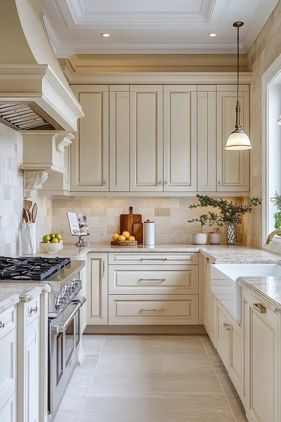
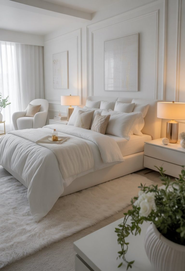
The brand’s own room list is generous. “From charming homestead exteriors to sun-drenched kitchens and cozy bedrooms, Melodious Ivory helps create environments that are warm, balanced and timeless.” A kitchen is the strongest case: the shade warms white cabinetry without turning yellow, and it sits well with marble, butcher block, and brass. A bedroom is the second: the warmth reads as calm rather than stimulating. And on an exterior, a creamy beige is forgiving in a way pure white is not — it hides dust and pairs with brick, stone, and natural wood trim.
The material advice is part of the pick. Melodious Ivory “pairs effortlessly with a wide range of materials, including timeworn wood, handmade crafts and comfy textiles, supporting the rise of slow living, mindful consumption and nostalgia-inspired aesthetics in today’s design landscape.”
Pairings That Work
The pairings follow from the palettes. For a traditional room, follow Heartland: the rich earthy red of Old Chaparral against the ivory, with a faded denim blue to cool it down. For a calm room, follow Rekindle: warm tan and a soothing green, both drawn from nature. For a cheerful room, follow Serendipity: a vintage yellow and a warm nectarine, with the ivory holding the walls.
There is also a practical point worth knowing before buying. “The Dutch Boy Paints 2026 Color Trend Forecast aims to simplify the painting experience for homeowners by providing an extensive selection of one-coat colors, including Melodious Ivory and its complementing palettes.” One-coat coverage is the brand’s long-running promise: fewer decisions, fewer coats, fewer surprises. Dutch Boy paints are sold at Menards, and the brand points shoppers to trends.dutchboy.com or their local Menards store for the full forecast.
For a bit of background, our explainer on Behr Color of the Year 2026: Hidden Gem N430-6A and the Smoky walks through the key points.
How It Fits the 2026 Colour Story
Melodious Ivory lands in a year when the industry’s picks lean warm and nature-inspired, and it is the softest voice in that chorus. Where other brands chose deep greens, dark browns, and heritage reds, Dutch Boy chose the lightest neutral of the season — a cream that warms a room instead of darkening it. Not every room wants drama, and a colour that makes a small room feel larger and a dark room feel brighter has a job the bold shades cannot do.
The change from last year is just as telling. Dutch Boy’s 2025 Color of the Year was Mapped Blue (429-5DB), “a versatile medium-tone blue with slight yellow undertones” — a cool, calm blue chosen for spaces that promote well-being. “Our 2025 Color of the Year, Mapped Blue, is more than just a trend: it’s a reflection of changing consumer values,” Parada said at the time, and the same sentence would fit 2026: the values moved on, from calm to connection, and the colour followed.
Putting It Together: A Fictional Example
Fictional example: imagine Sarah, a fictional homeowner in Ohio, repainting her kitchen and adjoining dining nook in Melodious Ivory. She paints the walls and the ceiling the same warm cream, keeps the existing oak table, and repaints only the lower cabinets in Cypress Garden from the Rekindle palette, leaving the uppers ivory. She swaps the old chrome handles for unlacquered brass and hangs a handmade ceramic pendant over the table. The first morning, the kitchen feels warmer than it did in white, but not darker — the sunlight still bounces, and the green cabinets now look intentional instead of random. One colour, three supporting players, and a tired kitchen now has a mood: slow mornings, real food, and people lingering at the table.
Frequently Asked Questions
What is Dutch Boy’s Color of the Year for 2026?
Melodious Ivory (313-2DB), a soft, creamy beige announced in August 2025. Dutch Boy presents it as a foundation for simplicity, authenticity, and intentional living.
For the bigger picture, there is a fuller breakdown of Valspar Color of the Year 2026: Warm Eucalyptus and the Haven at in our archive.
What colours go with Melodious Ivory?
Its three official palettes cover the range: Heartland pairs it with Old Chaparral red and Blue Laguna denim blue; Rekindle with 10 Gallon Hat tan and Cypress Garden green; Serendipity with Simply Yellow and Nice Nectarine. It also works as a backdrop for bold accents, timeworn wood, and handmade pieces.
Is Melodious Ivory just white paint?
No. It is a warm, creamy beige with enough pigment to read as a deliberate colour on the wall, not a default white. Test a large swatch in daylight and lamplight before committing.
Where can I buy Dutch Boy paint?
Dutch Boy paints are sold at Menards stores; the brand points shoppers to trends.dutchboy.com or their local Menards store for the 2026 Color Trend Forecast.
What was Dutch Boy’s Color of the Year before Melodious Ivory?
Mapped Blue (429-5DB) in 2025, a medium-tone blue with slight yellow undertones. The move from blue to warm cream mirrors the shift from calm to connection in the brand’s story.