Dunn-Edwards announces its Color of the Year on the first day of October, and for 2027 the announcement arrived with the smell of coffee in the air — literally. “Today, Dunn-Edwards Corporation announced its 2027 Color of the Year, French Press Coffee (DEBN07), a deep, nuanced brown softened by a subtle plum undertone that embodies the rich character of roasted coffee and the enduring appeal of lived in luxury.” It is the darkest of the major 2027 picks: a brown that asks you to slow down, sit still, and stay a while.
What French Press Coffee Actually Is
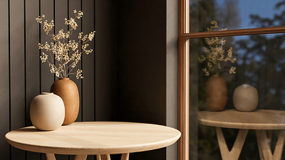
French Press Coffee is a deep brown with a whisper of warm purple running through it — not a flat chocolate, not a near-black, but a brown with a secret. “A deep, nuanced brown softened by a whisper of warm purple, French Press Coffee marries the comfort of freshly roasted coffee beans with the poise of layered luxury. It represents the ultimate elevated neutral, delivering enough depth to anchor a space while serving as a richer, more timeless alternative to stark black or charcoal.” That last comparison is the one to hold on to: black is stark, charcoal is cold, and French Press Coffee is neither. It has the same anchoring weight, but it is warm to the touch.
Dunn-Edwards calls it an elevated neutral, and the word “elevated” is doing real work. “More than a trend color, French Press Coffee is an elevated neutral — one with enough dimension to anchor a space while maintaining a softness that feels livable and refined.” It is also a colour that changes as the day goes on: “Its dynamic undertones — like the subtle hint of plum — reveal new depth throughout the day…” One honest note: Dunn-Edwards publishes no hex, RGB or light reflectance value for French Press Coffee — only the code DEBN07.
Why Dunn-Edwards Chose It
The choice did not start with a swatch. It started with a ritual. “Each season, as we prepare to announce what will become the year’s most iconic color, we reflect on several factors: global and cultural influences, the psychology of the home, palette cohesion, and timelessness vs. trends. Doing this work, our team often gathered over fresh cups of morning coffee to deliberate, unaware that this grounding daily ritual was part of the larger color story we’d be unveiling today.” “Much like the calming morning ritual of its namesake, this color invites you to pause, recharge, and settle in.”
Behind the ritual is a reading of the moment. “We’ve observed that our increasingly fast-paced and digital world is driving people to seek comfort in the opposite of tech: layered, tactile, human-created, and earth-influenced objects, spaces, and rituals.” The home, in that reading, has changed its job: “the places we call ‘home’… have shifted from being purely functional spaces to intentional sanctuaries where we can find genuine human connection, stillness, and balance.” The choice also had to survive a harder test: time. “Most importantly, we knew that our Color of the Year must offer lasting staying power beyond a single trend cycle. Rather than turning to a fleeting novelty color, we searched for an evolution of classic design…” And it had to play well with others: “With a noticeable shift toward natural materials, handmade elements, and organic textures, it became clear that 2027 called for a dimensional, anchoring hue that complements a variety of finishes.”
For the other end of the 2027 spectrum, see our article on Clark+Kensington Color of the Year 2027: Vantage Point 38B-4, the Sophisticated Blue from Ace Hardware.
The 2027 Color Trends Collection
French Press Coffee never stands alone in Dunn-Edwards’ 2027 offer. It anchors a full Color Trends collection of twelve colours, and the rest of the palette shows what the brand thinks the year looks like. The warmest companions are Hazelnut (DE6032), “a softened taupe with blush-brown undertones,” and Jazz Berry Jam (DET401), “a rich berry tone with muted plum undertones” that echoes the plum hiding inside French Press Coffee itself. Desert Gray (DEC760) is “a warm gray-beige with sandy undertones” for the sunbaked end of the palette, and Flickering Gold (DE6166) is “a luminous gold with honeyed amber undertones” that “captures the richness of candlelight.” The cooler companions keep the palette from getting too cosy: Made of Steel (DET593) is “a deep, cool blue-gray with slate undertones,” Spooky (DE6248) is “a pale, misty green-gray with silvery undertones,” and Overcast Sky (DE5821) is “a blue-gray with silvery undertones that creates a peaceful atmosphere.” Wilderness (DE6236) brings “a mid-tone gray-green with warm olive undertones” and Chic Brick (DE6104) is “a muted clay red with earthy undertones.”
How to Use It: Four Ways In
Dunn-Edwards does not leave you guessing how to use a colour this dark. The blog lays out four applications, and each one is a different size of commitment. The boldest is the Coffee Cocoon: “Use color-drenching to paint walls, baseboards, door frames, and ceilings in French Press Coffee. In compact, intimate rooms as well as dining and lounge spaces, this technique exudes lived-in luxury and showcases the full allure of its smoky undertones.” The press release adds the rooms that suit it best: “In smaller, more intimate spaces such as a powder room, a study, or an entryway, color-drenching in French Press Coffee brings out the full complexity of its undertone and leans fully into lived-in luxury.”
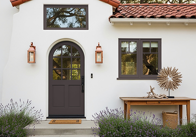
The second application is the Architectural Anchor, for rooms you do not want to drench. “In airy, sunlit spaces, French Press Coffee acts as an anchor. Apply it to custom-built-ins, detailed crown molding, interior doors, or fireplace mantels to introduce tailored structure and contrast without overwhelming the natural light.” The third application goes outside. “On building exteriors, French Press Coffee brings architectural drama with a softer edge than standard black. Use it across front entryways, garage doors, shutters, or window sashes, pairing it with natural stone, warm mushroom tones, creamy off-whites, or on stucco for a balanced, high-end facade.”
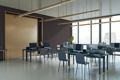
The fourth application is the one most people will never try at home, but it explains why the colour exists at all: Commercial Comfort. “In boutique hospitality settings, modern offices, upscale retail stores, and shared multifamily spaces, French Press Coffee masks smudges and high-touch wear while cultivating an elevated, welcoming atmosphere that guests and clients remember.” As for pairings, the plum undertone earns its keep: “French Press Coffee pairs well with earthy greens, clay tones, and soft creams, which complement the subtle plum undertone, while walnut, aged brass, honed marble, and linen textiles stand out beautifully against its dark, smoky presence.”
From Midnight Garden to French Press Coffee
The shift from 2026 to 2027 is a shift from green to brown, and from a garden to a kitchen. Dunn-Edwards’ 2026 Color of the Year was Midnight Garden, which we covered on this site in our batch 11 — a dark, moody green for rooms that wanted depth with a living, growing feel. French Press Coffee keeps the depth and the mood, but swaps the garden for the coffee pot: warmer, browner, more domestic. The brand behind the pick is an old one entering its second century: Dunn-Edwards is “one of the nation’s leading manufacturers and distributors of premium architectural, industrial, and high-performance paints,” with “over 170 company stores in California, Arizona, Nevada, New Mexico and Texas,” and it is “a wholly owned subsidiary of Osaka, Japan-based Nippon Paint Holdings Co., Ltd.”
Putting It Together: A Fictional Example
Fictional example: imagine Sarah and James, fictional homeowners in Austin, Texas, repainting the ground floor of the 1970s ranch house they bought last year. They color-drench the powder room in French Press Coffee — walls, trim and ceiling — and hang a brass mirror against it. In the living room they paint only the fireplace surround and the built-in shelves, keeping the walls a soft cream. They paint the front door in French Press Coffee against warm white stucco, with a brass handle and a walnut bench beside it. And in the kitchen they paint the lower cabinets, the uppers staying Antique Paper.
For a soft herbal green on the lighter side of the 2027 palette, our article on Sherwin-Williams Colour of the Year 2027: Celery SW 6421, a Soft Herbal Green walks through the key points.
Frequently Asked Questions
What is Dunn-Edwards’ Color of the Year for 2027?
French Press Coffee, code DEBN07 — a deep, nuanced brown softened by a subtle plum undertone, announced on 1 October 2026 as Dunn-Edwards’ 2027 Color of the Year.
Is French Press Coffee black or brown?
Brown — a deep brown with a whisper of warm purple, a richer and more timeless alternative to stark black or charcoal.
What colours go with French Press Coffee?
Earthy greens, clay tones and soft creams complement the plum undertone; walnut, aged brass, honed marble and linen stand out against its dark, smoky presence.
Can I use French Press Coffee on an exterior?
Yes — it brings a classic architectural quality to front doors and works as an elevated alternative to black on shutters, garages and trim, paired with taupe, mushroom or cream.
Can I color-drench a room in French Press Coffee?
Yes — Dunn-Edwards recommends it for smaller, intimate spaces such as a powder room, a study or an entryway, where drenching brings out the full complexity of the plum undertone.