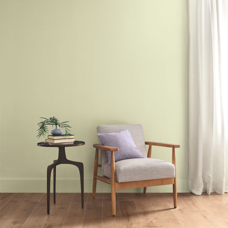
Sherwin-Williams announces its Color of the Year in mid-September, and for 2027 the announcement came with a partner: HGTV Home by Sherwin-Williams, naming the same colour on the same day. “Sherwin-Williams and HGTV Home by Sherwin-Williams are unveiling a unified 2027 Color of the Year: Celery. A soft, muted green with subtle yellow undertones, Celery offers a fresh perspective on comfort and calm, bringing a light and airy presence to interiors while encouraging a renewed sense of balance in daily life.” Celery SW 6421 — also sold as HGSW6421 at Lowe’s — is a pale, herbal green, the lightest of the major 2027 picks.
What Celery Actually Is
The press release’s description is the one to trust, because every other account of the colour repeats it: “A soft, muted green with subtle yellow undertones.” Sherwin-Williams adds: “Celery is a soft, fresh yellow green with subtle warmth that brings a calming yet uplifting presence to any space.” The press release also calls it “peaceful as a sunny glade” — a bright, airy clearing in the forest. And the brand’s own summary is the most quotable of the year: “Clarity and comfort unite in our 2027 Color of the Year, Celery SW 6421, an airy, herbal green that embodies fresh perspectives and elegance.” Airy and herbal — light enough to feel like air and green enough to feel like a plant.
The numbers tell the same story. Sherwin-Williams’ colour page lists Celery’s screen values as RGB 224, 221, 189 — hex #E0DDBD — a pale yellow-green in which the red and green channels are nearly equal and the blue trails behind, which is what gives the shade its warmth. Independent colour guides put its light reflectance value at about 71, firmly on the light side; Sherwin-Williams itself has not published an LRV for this listing, so treat 71 as a guide’s estimate, not the brand’s number. In practice Celery reflects most of the light that hits it, so it reads as a tinted white in a bright room and as a soft green in a dim one — test it on the actual wall first.
Why Celery, and Why Now
Ashley Banbury, Sherwin-Williams’ Color Marketing Manager, picked the colour, and her explanation is the heart of the announcement. “Celery stood out right away, but it was also a color I kept coming back to throughout the process,” she says. “It really encapsulated the trends we were seeing across industries and reflected a broader desire for colors that feel fresh, balanced, and approachable.” The Trendsight Team kept seeing the same signal everywhere: “We’re seeing green emerge across multiple industries – in both fashion and interiors, which is often a strong signal of a broader cultural shift.”
The press release states the reasoning in one sentence: “Celery was chosen as the 2027 Color of the Year because it reflects today’s priorities: wellness, balance and connection.” Banbury expands it on the brand’s own pages: “People are looking for shades that feel fresh and uplifting but are also usable enough to incorporate into their everyday spaces. They’re looking for calm, restoration, and connection.” A colour that supports well-being is one you can actually live with — pale enough for a whole room, warm enough not to feel clinical. “Celery’s adaptability is endless. It’s fresh with a sense of energy and optimism that can support productivity and connection, while its soft undertones create a calming backdrop for rest and recharging.”
The Rewild Palette
Celery does not arrive alone. It was selected from Sherwin-Williams’ 2027 Colormix Trend Forecast, called Rewild — a 48-colour palette, including ten “Continuity Colors,” organised around the themes Revive, Reignite, and Reconnect. The coordinating palette the press release names is the practical part: “Celery SW 6421 pairs beautifully with a curated palette of complementary hues including White Flour SW 7102, Potentially Purple SW 6821, Cosmos SW 6528, Georgian Bay SW 6509, Artichoke SW 6179, Cocoon SW 6173, Woven Wicker SW 9104, Kirsch Red SW 6313, Plum Brown SW 6272 and complementary Minwax® stain, Pickled Oak MW 260.” Nine paints and one wood stain, designed to be used in full.
The press release explains how the nine fit together: “Tones like Kirsch Red and Plum Brown introduce bold warmth and sophistication, while accents such as Potentially Purple and Cosmos add a refined softness and quiet elegance. Deeper shades like Georgian Bay, Artichoke and Cocoon create contrast and anchor the palette, while Woven Wicker and White Flour provide light, breathable neutrals that keep the look approachable.” The logic is a ladder: Celery at the top, light and airy; White Flour and Woven Wicker as the neutrals that keep it grounded; Artichoke, Cocoon, and Georgian Bay as the deep tones; and Kirsch Red, Plum Brown, Potentially Purple, and Cosmos as the accents. The simplest pairing: Celery on the walls, White Flour on the trim, and one deep tone — Artichoke on a door.
Where Celery Works
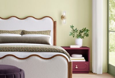
Sherwin-Williams shows Celery in four rooms on its own pages, and each one teaches a different use. The bedroom is the fullest dose: Celery on the walls, a nightstand painted Kirsch Red, and the trim in dark Artichoke green. The red nightstand is the move to copy — a small piece of furniture in the boldest colour of the palette, so the room gets its warmth from one object rather than a whole wall. The bathroom is the calmest dose: Celery walls, a door painted White Flour, and a vanity in Pickled Oak stain. Pale green walls, a white door, and pale oak wood is a combination that cannot go wrong.
The kitchen is the bravest dose, and the one the brand clearly wants you to try. “It can be used on walls to bring fresh balance; or on millwork, kitchen cabinetry, textiles, and decorative finishes to provide a gentle backdrop for luxurious elements such as brushed brass, marble, fluted detailing, and sculptural lighting.” Celery cabinets against Cocoon walls is the combination in the brand’s own photograph: the cabinets carry the colour, the walls carry the depth, and the brass and marble do the luxury. The dining room is the most dramatic dose: Celery walls with Plum Brown double doors, a round white table, and a blue sideboard. The lesson of all four rooms is the same: Celery is a background colour that needs one darker partner and one warmer accent. “Rather than competing with statement pieces, Celery acts as a restorative foundation that softens bold forms and metallic accents.”
From Universal Khaki to Celery
The shift from 2026 to 2027 is a sharp one for Sherwin-Williams. The 2026 Color of the Year was Universal Khaki, a warm, earthy neutral — a colour that asked nothing of its owner and gave back a calm, settled room. Celery is the opposite move: lighter, greener, and more alive, a colour that asks the room to feel fresh rather than settled. The brand is not abandoning neutrals — White Flour and Woven Wicker are still in the palette — but the headline has moved from khaki to a vegetable garden. For anyone who painted with Universal Khaki last year, the 2027 palette sits alongside it: khaki on the big surfaces, Celery on the doors and the island. Test a sample in morning, evening, and lamplight first: a pale yellow-green looks different in all three.

Putting It Together: A Fictional Example
Fictional example:
Fictional example:
Fictional example: imagine Daniel, a fictional homeowner in Ohio, repainting the ground floor of a 1990s split-level. He starts small: Celery on the front door and the dining-room walls, Plum Brown on the double doors, White Flour on the trim. The kitchen gets the brave move — Celery on the island only, the cream cabinets left alone. In the bedroom he paints the nightstand Kirsch Red and leaves the walls the warm white they already are. One colour, three doses, and a house that finally feels fresh without feeling repainted.
Frequently Asked Questions
What is Sherwin-Williams’ Color of the Year for 2027?
Celery SW 6421, a soft, muted green with subtle yellow undertones, announced on 15 September 2026 jointly with HGTV Home by Sherwin-Williams, which sells it as HGSW6421.
What is Celery’s RGB value?
RGB 224, 221, 189, hex #E0DDBD, as listed on Sherwin-Williams’ colour page. Guides put its LRV at about 71; Sherwin-Williams has not published one.
What colours go with Celery?
The coordinating palette: White Flour, Woven Wicker, Artichoke, Cocoon, Georgian Bay, Kirsch Red, Plum Brown, Potentially Purple, Cosmos, and Minwax Pickled Oak stain for wood.
Where should I use Celery?
On walls, on kitchen cabinetry or an island, on millwork and trim, or as a front door — paired with one deep tone and one warm accent.
Is Celery the same as Benjamin Moore’s Webster Green?
No. Both are 2027 greens, but Webster Green HC-130 is a deeper mid-tone green, while Celery is a pale, airy yellow-green — the lightest of the major 2027 picks.