On 29 April 2025, in London, the trend forecaster WGSN and its color partner Coloro named Luminous Blue their Colour of the Year for 2027. The shade carries the Coloro code 125-28-38, and the same announcement unveiled the five Key Colours for spring and summer 2027, chosen from Coloro’s library of more than 3,500 hues. WGSN names its color two years ahead, so the 2027 pick is already shaping what you will see in shops. One mix-up to clear up first: Transformative Teal is the 2026 pick, not 2027. This guide explains the theme behind it, the five key colors that come with it, and how to use a deep blue in your home now, without waiting for 2027.

Interconnectedness: The Idea Behind the Colour
WGSN says interconnectedness will be a defining theme going into 2027, and it drives the whole Key Colour selection. The idea is that the world is defined by connections between polarities: lightness and darkness, nature and technology, ancient and contemporary, online and offline, rationality and spirituality. Color, in this view, is where those opposites meet and balance each other: palettes that balance functionality, practicality, and innovation with contrary themes of amusement, spirituality, and emotion. It is also practical: Luminous Blue is not meant to stand alone, but to sit next to its opposites.
The emotional case for the palette is just as explicit. WGSN says growing interest in color and emotion will give rise to colors that provide a sensory link to tradition, culture, and wisdom, which can feel both grounding and resilient, and that these earthy pigments are inspired by the search for purpose and meaningful connection to community and nature, as people continue to be overwhelmed by the pressures of a polycrisis in 2027. Playful and joyful hues will be vital too, used as a coping mechanism to rise above the stresses of the world. Clare Smith, WGSN’s senior color strategist, describes Luminous Blue itself as both mysterious and eccentric, with versatility and a broad appeal that will resonate from occasionwear to active. WGSN also says its forecasts are built on 93 percent accuracy, which is the company’s own claim about its own work, not an independently audited figure.
We have also covered Pantone Color of the Year 2026: Cloud Dancer and How to Use in a separate guide.
The Five Key Colours for Spring and Summer 2027
Luminous Blue leads a set of five, and the set is the real forecast. The other four are Energy Orange, Coloro 018-57-34, a high-vibrancy hue that demonstrates resilience in the face of change, including climate change, offering vitality and a sense of security. Pop Pink, Coloro 151-73-22, is joyful, uplifting, and carefree, linked to a state of strategic joy and playfulness that will drive consumers and businesses in 2027. Meadowland Green, Coloro 050-61-19, is a nourishing mid-green that evokes rest and carefree tranquility. Clay, Coloro 014-60-13, is a pink-toned neutral with a warm, earthy quality that feels both trustworthy and resilient.
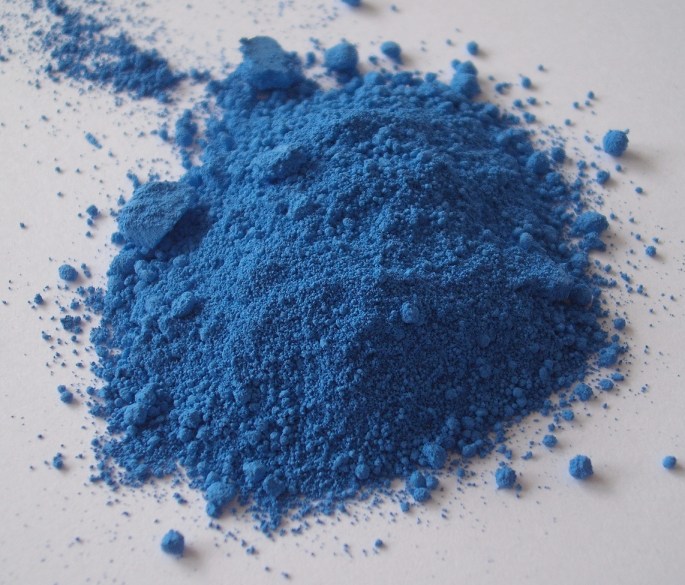
The structure of the five is deliberate, and it mirrors the interconnectedness theme. One deep anchor in Luminous Blue. Two brights in Energy Orange and Pop Pink, the coping-mechanism colors. One restful green in Meadowland Green, the color of slowing down. One warm neutral in Clay, the color that holds the others together. Secondary sources describe Luminous Blue as a rich sapphire between lapis lazuli and cobalt. In a home, that structure translates directly into proportions: the blue as the anchor on one wall or one large piece of furniture, Clay as the warm neutral on the other walls, Meadowland Green in plants and textiles, and the orange and pink as small accents, a cushion, a vase, a piece of art, never as the main event.

From Transformative Teal to Luminous Blue
The predecessor matters, because it shows how fast the forecast moves. Transformative Teal, Coloro 092-37-14, was WGSN and Coloro’s Colour of the Year for 2026, announced in September 2024 for the autumn and winter 2026 season, under the theme of redirection, which challenged old ideas and sought opportunities for urgent change. The teal was chosen for the way it champions an Earth-first mindset, a fusion of dependable dark blue and aquatic green that connects the digital and the terrestrial. The 2026 pick looked down, at earth and water; the 2027 pick looks across, at connections between people, nature, and technology. Both are deep, watery blues: WGSN’s forecasts move in steps, not jumps.
If you want to dig deeper, see our piece on Color Trends 2026 Forecast Guide: Transformative Teal and the Season Palettes.
It is also worth knowing what this forecast is not. WGSN and Coloro are trend forecasters, not paint manufacturers, so Luminous Blue is a direction for fashion, beauty, products, and homes, not a paint you can buy by that name. And as of early November 2026, Pantone had not yet announced its own 2027 selection, which it usually reveals in early December, so the WGSN pick stands alone for now as the earliest signal of where 2027 color is heading. That is the value of a forecast published two years early: a head start, not a consensus.
How to Use a Deep Blue Before 2027 Arrives
You do not have to wait for 2027 to use this color, because deep blues are already in the shops, in paint, in velvet, in ceramics, and in art. The practical rule is the same as for any dark color: one anchor, not four walls of it, unless the room is large and well lit. A single wall in a deep sapphire blue behind a bed or a sofa, with the other walls in a warm, clay-like neutral, gives you the drama without the cave. A velvet sofa or armchair in a deep blue does the same job in a room you cannot paint, and it pairs naturally with the rest of the forecast palette: a clay-toned lamp, a green plant, a pink cushion, an orange vase. The blue is the anchor, and the other four colors are the relief around it.
Light matters more with a deep blue than with almost any other color. In a north-facing room, a deep blue reads cooler and can turn grey, so it needs warm artificial light in the evenings and warm materials next to it, wood, brass, cream textiles, to keep it from feeling cold. In warm afternoon sun, the same blue turns richer and deeper, almost luminous, which is where the name earns itself. Sample it the way professionals do: paint a large board, move it between rooms, and check it in the morning, at noon, and in the evening before committing. Coloro does not use HEX values, so match it by holding paint swatches next to a printed reference in your own light. In fashion, Clare Smith says the blue will resonate from occasionwear to active, as a statement dress and as an everyday jacket.
There is more on this in our article about Benjamin Moore Color of the Year 2026: Silhouette AF-655 and the Return.
Putting It Together: A Fictional Example
Fictional example: imagine a renter in a small flat with plain white walls she is not allowed to paint, drawn to Luminous Blue because her flat feels cold and impersonal. The first attempt buys everything blue at once, curtains, rug, cushions, bedding, and the flat feels like an aquarium. The redesign keeps the blue to one thing that matters, a deep blue velvet armchair and a large art print in blues and clay tones above it, paints nothing, and adds a clay-colored ceramic lamp, a green plant on the windowsill, and a single pop-pink cushion on the chair. The blue now anchors the room, the clay warms it, the green calms it, and the pink makes it feel alive. Nothing is painted, nothing is permanent, and the whole look can change with one cushion.
Frequently Asked Questions
What is WGSN and Coloro’s Colour of the Year 2027?
Luminous Blue, Coloro code 125-28-38, announced on 29 April 2025 in London. It leads the five Key Colours for spring and summer 2027, chosen from Coloro’s library of more than 3,500 hues.
What are the five Key Colours for spring and summer 2027?
Luminous Blue 125-28-38, Energy Orange 018-57-34, Pop Pink 151-73-22, Meadowland Green 050-61-19, and Clay 014-60-13. One deep anchor, two brights, one restful green, and one warm neutral.
Our earlier guide to Sherwin-Williams Color of the Year 2026: Universal Khaki SW 6150 is worth a read as well.
What does interconnectedness mean in this forecast?
Connections between polarities: lightness and darkness, nature and technology, ancient and contemporary, online and offline, rationality and spirituality. Palettes balance function and innovation with amusement, spirituality, and emotion.
Is Transformative Teal the 2027 colour?
No. Transformative Teal, Coloro 092-37-14, is WGSN and Coloro’s pick for 2026, announced in September 2024 under the theme of redirection. Luminous Blue is the 2027 pick.
Has Pantone announced its 2027 colour yet?
Not as of early November 2026. Pantone usually reveals its pick in early December, so the WGSN and Coloro announcement stands alone for now as the earliest signal for 2027.