
Adobe Illustrator Color Swatches – UMDGF
How to Create an Illustrator Spot Colour Swatch
I remember the first time I accidentally sent a job to a printer with a process blue instead of a Pantone 300. The proof came back looking like a bruised sky. My client wasn't thrilled. My wallet wasn't thrilled either. That's the moment I learned that How to Create an Illustrator Spot Colour Swatch isn't just some trivial checkbox in your workflow—it's the difference between a print job that sings and one that silently costs you a reprint.
Let's be honest. The Swatches panel can feel like a cluttered toolbox. You open it, you see a rainbow of random fills, and you think, "I'll just pick a colour and go." But spot colours are different. They're the precision instruments of the design world. They demand respect. And if you're going to master them, you need to understand the entire process from start to finish.
So grab your coffee. Or tea. I don't judge. Let's dig into the real nuts and bolts of How to Create an Illustrator Spot Colour Swatch the right way.
Understanding the Difference Between Process and Spot Colours
Before we start clicking buttons, we need to talk about what a spot colour actually is. This isn't just academic theory. This is the kind of knowledge that saves your butt when the press operator calls you at 10 PM.
A process colour is built from four inks: Cyan, Magenta, Yellow, and Black. Your screen mixes them. The printer lays down tiny dots. The result is a convincing illusion of a full spectrum. But it's an illusion. A spot colour, on the other hand, is a single, pre-mixed ink. It's printed using its own dedicated plate. It doesn't rely on the CMYK dance. It just is.
Why Process Colours Fail You Sometimes
Here's the thing about process colours. They can't hit every colour in the visible spectrum. Seriously. Try printing a vibrant neon orange or a deep metallic gold using only CMYK. You'll get something that looks like a muddy approximation. Spot colours solve that. They give you consistency across different materials, different printers, and even different countries. That's why How to Create an Illustrator Spot Colour Swatch is a skill every professional needs in their back pocket.
The Anatomy of a Spot Colour Swatch
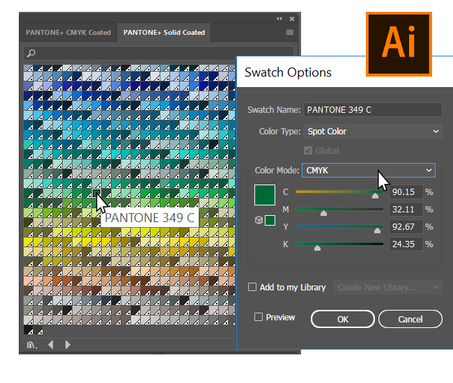
A proper spot colour swatch in Illustrator isn't just a coloured square. It carries metadata. It knows its Lab values, its CMYK breakdown, and most importantly, it knows it's a spot colour. When you create one correctly, Illustrator will automatically assign it to its own separation plate. That means when you export a PDF, the printer sees a dedicated layer for that ink. No guessing. No "I think this is supposed to be a spot." Just clean, reliable output.
Spot Color Illustrator
The Step-by-Step Process of Creating a Spot Colour Swatch
Alright, enough theory. Let's get our hands dirty. Open Illustrator. I'll wait.
Good. Now, there are two main ways to approach How to Create an Illustrator Spot Colour Swatch. One is quick and dirty. The other is correct and professional. We're going to do the professional one. Because you're not a hobbyist. You're a pro.
Using the Swatch Panel for Precision
First, open your Swatches panel. You can find it under Window > Swatches, or hit F5 if you're feeling fancy. Look at the bottom of the panel. See that little folder icon? The one that looks like a manila folder from 1995? That's your colour group button. Ignore it for now.
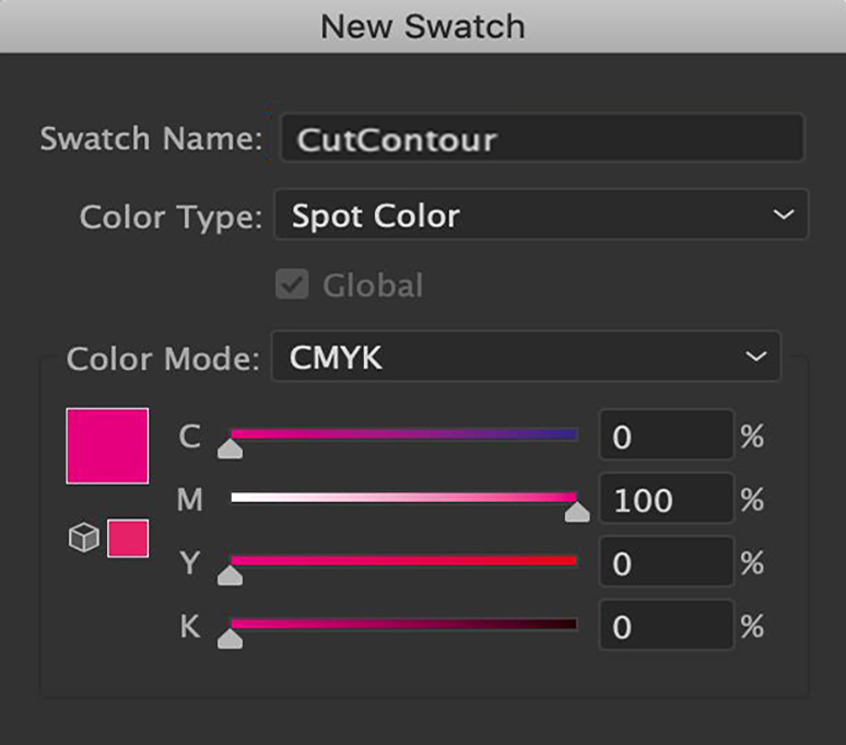
Click the New Swatch button. It looks like a tiny piece of paper with a folded corner. A dialog box pops up. This is where the magic happens.
Adjust your sliders. Watch the preview. When you're happy, click OK. You've just created a spot colour swatch. But we're not done yet.
Creating a Spot Colour from an Existing Object
Spot Color Illustrator
Sometimes you have a shape on your artboard that already has the perfect colour. Maybe you eyedropped it from a photo. Maybe you spent twenty minutes tweaking sliders. You don't want to lose that. Good news: you don't have to.
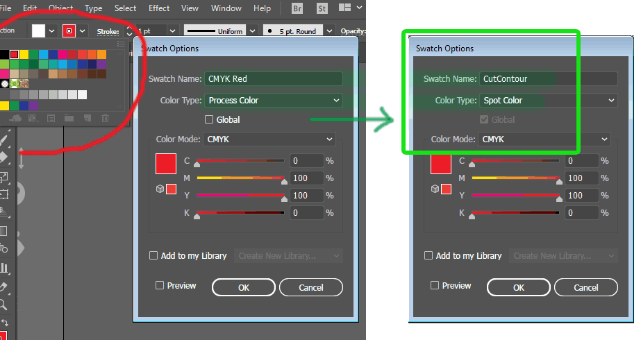
Select the object. Look at the Fill or Stroke colour in the Tools panel. Drag that little colour square directly into the Swatches panel. A new swatch appears. Double-click it. In the dialog box, change the Colour Type to Spot Colour. Rename it. Click OK. That's it. You've converted a random fill into a reusable, print-ready spot colour. This is one of the fastest ways to master How to Create an Illustrator Spot Colour Swatch on the fly.
The Critical Role of Global Swatches in Spot Colour Work
Here's a pro tip that separates the amateurs from the veterans. When you create a spot colour swatch, you should almost always check the box that says "Global." Why? Because global swatches are linked. Change the swatch once, and every object using that colour updates instantly.
Think about that for a second. You're working on a massive packaging design. There are fifty shapes using your brand's signature red. The client calls and says, "Can we make it a bit warmer?" Without a global swatch, you're selecting fifty objects manually. With a global swatch, you double-click, slide the slider, and the whole document updates. It's like magic. But it's not magic. It's just smart swatch management.
How Global Swatches Interact with Spot Colours
When you combine a global swatch with a spot colour, you get the best of both worlds. The colour is globally editable, and it prints on its own plate. This is the gold standard for How to Create an Illustrator Spot Colour Swatch in a professional workflow. Every branding project I've ever worked on uses this setup. It's reliable. It's fast. And it prevents the kind of mistakes that lead to expensive reprints.
One caveat: be careful when you're sharing files. If you send a document with global spot swatches to another designer, they might not have the same colour libraries installed. Always embed your swatches in the file. Illustrator does this by default, but it's worth double-checking.
Saving Your Spot Colour Swatches for Future Use
You've created the perfect spot colour. It's global. It's named. It's beautiful. Now you need to use it again next week. Don't rely on memory. Save your swatches as a library.
Open the Swatches panel menu (that little hamburger icon in the top right). Choose "Save Swatches." Give it a name like "Client Brand 2024." Save it somewhere you'll remember. Next time you start a new document, open that library from the same menu. Your spot colours are ready to go. This is the final piece of the puzzle for How to Create an Illustrator Spot Colour Swatch that lasts beyond a single project.
Spot colour or CMYK? | Inspired Print Solutions
Common Questions About How to Create an Illustrator Spot Colour Swatch
What's the difference between a spot colour and a global process colour?
A global process colour is still made from CMYK inks. It just updates globally when you edit it. A spot colour, however, is a dedicated ink that prints on its own plate. It can be global too, but the key distinction is the ink itself. Spot colours are for precision and special effects. Global process colours are for convenience.
Can I convert a spot colour to process later?
Yes, you can. Double-click the swatch and change the Colour Type from Spot Colour to Process Colour. But be warned: the appearance will change. Your vibrant spot blue will now be approximated by CMYK dots. It might look duller. Always check the result on a proof before committing.
Why does my spot colour look different on screen?
Monitors use RGB. Spot colours are defined in Lab or CMYK. Your screen can't perfectly display a physical ink. It's an approximation. Always use a physical swatch book (like a Pantone fan deck) to verify the real colour. Trust the book, not the screen.
How do I know if a swatch is already a spot colour?
Look at the Swatches panel. Spot colour swatches have a small white dot with a black border in the bottom-right corner of the swatch thumbnail. Process colours don't have this icon. It's a quick visual check that saves you from accidental process printing.
Can I use spot colours in RGB documents?
Technically, yes. Illustrator lets you create spot colours in any colour mode. But it's a bad idea. Spot colours are designed for print. If you're working in RGB for web or screen, you don't need spot colours at all. Stick to CMYK or Lab for spot colour work.
-1744373862.webp/295631ba836895098718314d837cc5b2/image-13-(11)-1744373862.webp "Pantone Spot Colors in Illustrator: Create Custom Swatches Without ...")
Pantone Spot Colors in Illustrator: Create Custom Swatches Without …
Troubleshooting Common Spot Colour Issues
Even with the best workflow, things can go wrong. Let's talk about the most common headaches and how to fix them.
The Spot Colour Isn't Separating Correctly
You've created your swatch. You've applied it. But when you export to PDF, the spot colour appears on the process plate. What gives? The most likely culprit is an overprint setting. Check your Attributes panel. Make sure "Overprint Fill" or "Overprint Stroke" isn't accidentally checked. Overprinting a spot colour onto a process colour can cause weird separation results.
Another possibility: you might have applied the spot colour as a tint. Tints of spot colours are still spot colours, but some PDF workflows handle them differently. If you're having issues, try applying the full strength colour first and then adjusting the opacity in the Transparency panel instead of using a tint swatch.
The Colour Looks Wrong on the Proof
This is almost always a colour management issue. Your monitor profile doesn't match the printer's profile. The solution is to soft-proof your document. Go to View > Proof Setup > Custom. Choose the printer's profile. Then toggle View > Proof Colours on and off. You'll see a preview of how the spot colour will actually print. It might be uglier than what you see in normal view, but it's more accurate.
If the proof still looks wrong, you need to check your swatch values. Compare them to the physical swatch book. I've seen designers accidentally type 50% Cyan instead of 100%. It happens. Double-check your numbers.
The Spot Colour Won't Export to PDF
This is a rare but frustrating issue. Usually, it means your PDF export settings are stripping spot colours. In the PDF export dialog, go to the Output section. Make sure "Convert Spot Colors to Process" is unchecked. Also, check that "Preserve Spot Colors" is selected. If you're using a PDF preset designed for web or screen, it might be automatically converting everything to process. Create a custom preset for print that keeps spot colours intact.
Advanced Techniques for Spot Colour Mastery
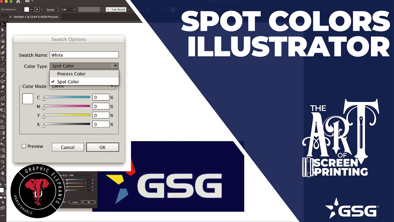
How to Create Spot Colors in Illustrator Tutorial | The Art of Screen …
You've got the basics down. Now let's push further. These are the techniques I use when I'm working on high-end packaging or multi-ink branding systems.
Creating Spot Colour Tints and Shades
You can create a tint of a spot colour without losing its spot status. In the Swatches panel, select your spot colour. Click the New Swatch button again. In the dialog, you'll see a Tint slider. Set it to 50%. The new swatch will still be a spot colour. It will still print on its own plate. But the printer will use a halftone screen to create the lighter version. This is incredibly useful for gradients and shadows in spot colour work.
Be careful with very light tints. Below 10%, the halftone dots become so small they might not print reliably. Stick to 20% or higher for consistent results.
Working with Multiple Spot Colours
Some projects use two or three spot colours. Maybe a brand uses a specific red and a specific silver. Each needs its own swatch. Each needs its own plate. When you export the PDF, you'll see separate separation pages for each spot colour. This is normal. But it means your file size will be larger, and your print costs will be higher. Spot colours are premium tools. Use them sparingly and strategically.
Combining Spot Colours with Process Colours
This is where things get interesting. You can have a document that uses four process colours plus one or two spot colours. The spot colours will print on top of the process colours. This allows for effects like metallic highlights or fluorescent accents on top of a full-colour image. It's a powerful technique, but it requires careful planning. The spot colour plate must be registered perfectly with the process plates. Any misalignment will be obvious.
When you're setting up this kind of job, talk to your printer first. They can tell you the minimum line weight for spot colour traps and the recommended overprint settings. Don't guess. Ask.
Final Thoughts on Building a Reliable Spot Colour Workflow
Look, I've been doing this for over a decade. I've made every mistake in the book. I've sent files with missing spot colours. I've accidentally used process colours when I meant to use spots. I've had to redo entire packaging runs because of a swatch that wasn't set to global. It's embarrassing. It's expensive. And it's completely avoidable.
The key to mastering How to Create an Illustrator Spot Colour Swatch is consistency. Build a system. Name your swatches clearly. Use global settings. Save your libraries. Check your separations before you hit send. It takes an extra five minutes, but it saves you hours of headache later.
And never, ever trust your screen. Seriously. Your monitor is a liar. It shows you bright, saturated colours that no printer can reproduce. The only truth is the physical swatch book. Keep one on your desk. Use it. Your clients will thank you, your printer will thank you, and your bank account will thank you.
Now go create some spot colours. You've got this.